Insights and workshops
The assessment period went smoothly, providing us with valuable insights for further investigation. The team decided to keep the original "W" icon from the logo while recognizing the benefits of updating the color palette, typography, imagery, and other assets to reflect a refreshed brand personality.
To align our efforts with business goals, user needs, and product features, I conducted internal workshops. I designed a chart to analyze the correlation between different personas' needs and existing product features, helping us identify how to stand out, deliver, and engage with each audience group. This analysis also highlighted the brand's strengths and weaknesses.
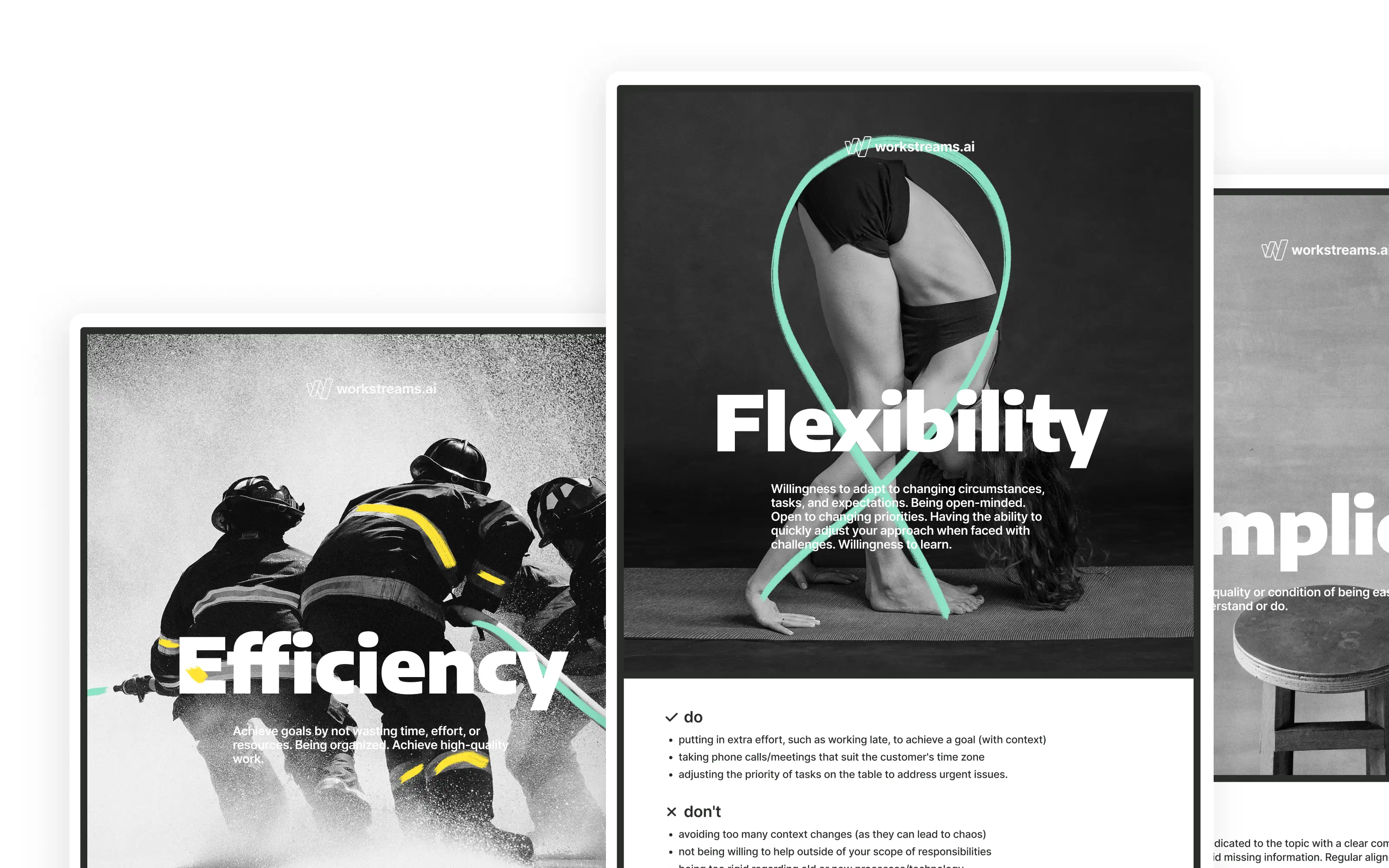
Additionally, I facilitated a brand archetype workshop based on Jungian archetypes, where all team members participated and voted.
A notable study during this project was a survey on the perceived emotions associated with blue and green colors. This study aimed to introduce green as a unique differentiation from the commonly used blue among competitors.
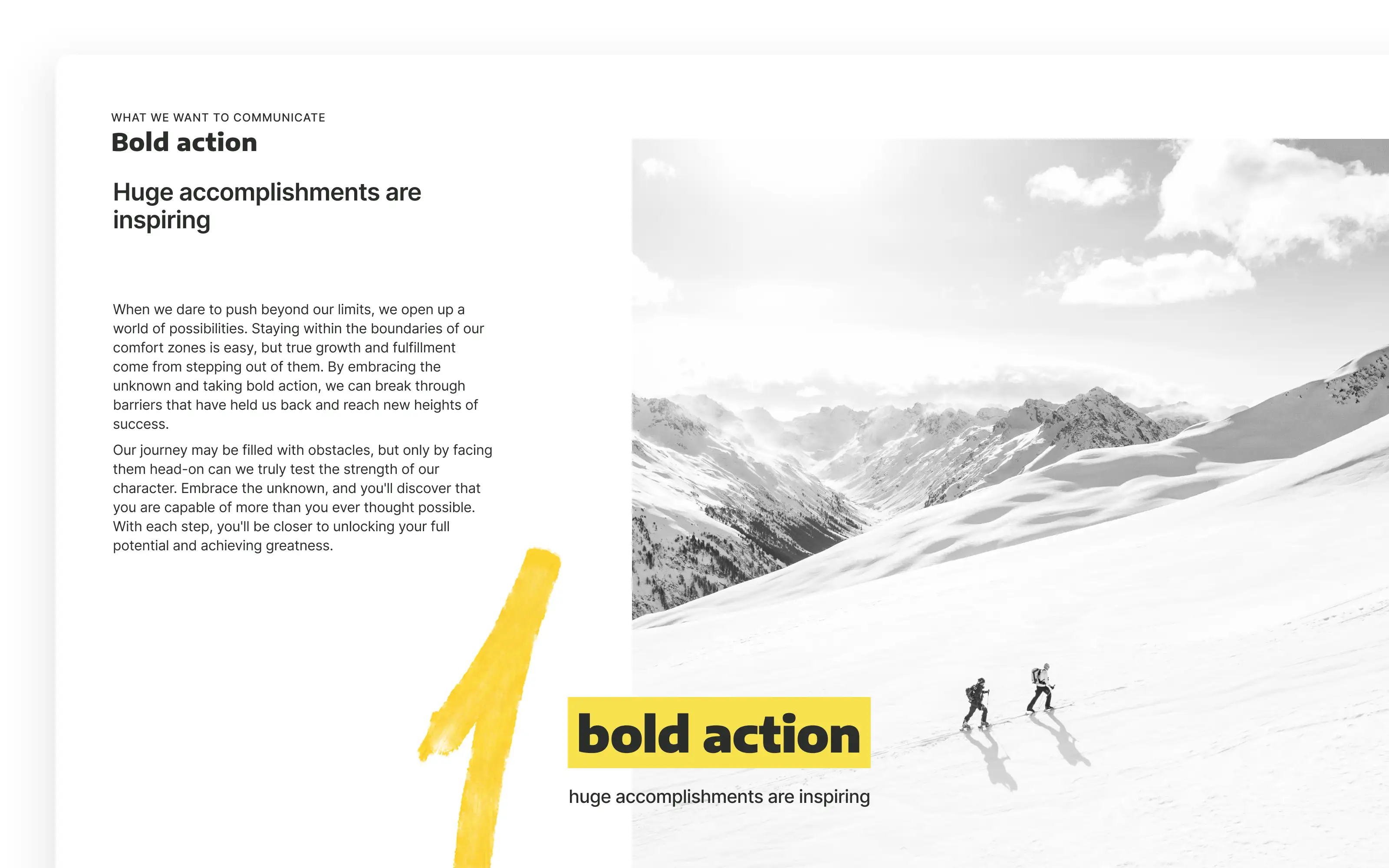
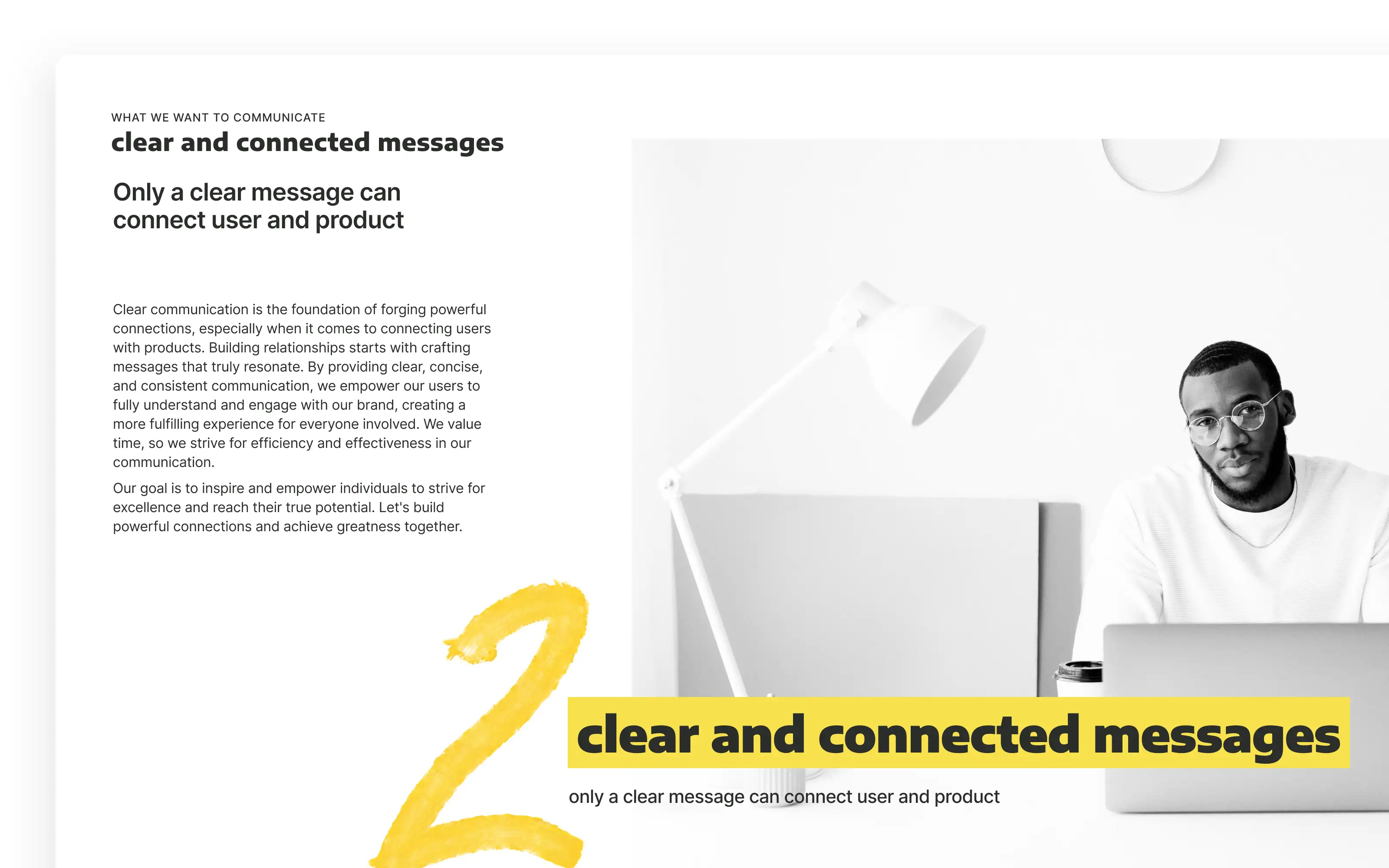
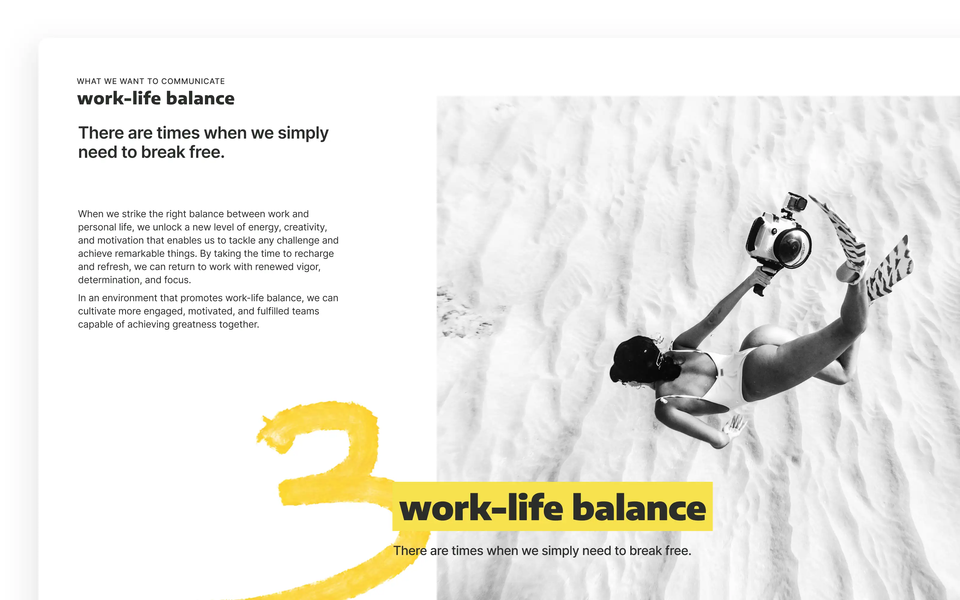
Based on the collected data and insights from brand archetype and value proposition design workshops, as well as market opportunities and competitor analysis, I presented a rebranding strategy. This strategy addressed immediate technical issues, introduced mid-term solutions for a refreshed brand look, and outlined a path towards embedding a user-centric design culture as a core business strategy.
The result and impact
The first phase concluded successfully! We established a transparent, contemporary, and aligned brand communication strategy. This achievement fostered a strong sense of business purpose within the team. It was evident in our meetings that we had reached our goal. Stakeholders gained a clearer understanding of the product’s potential, our market positioning, and the marketing team’s path to growth.
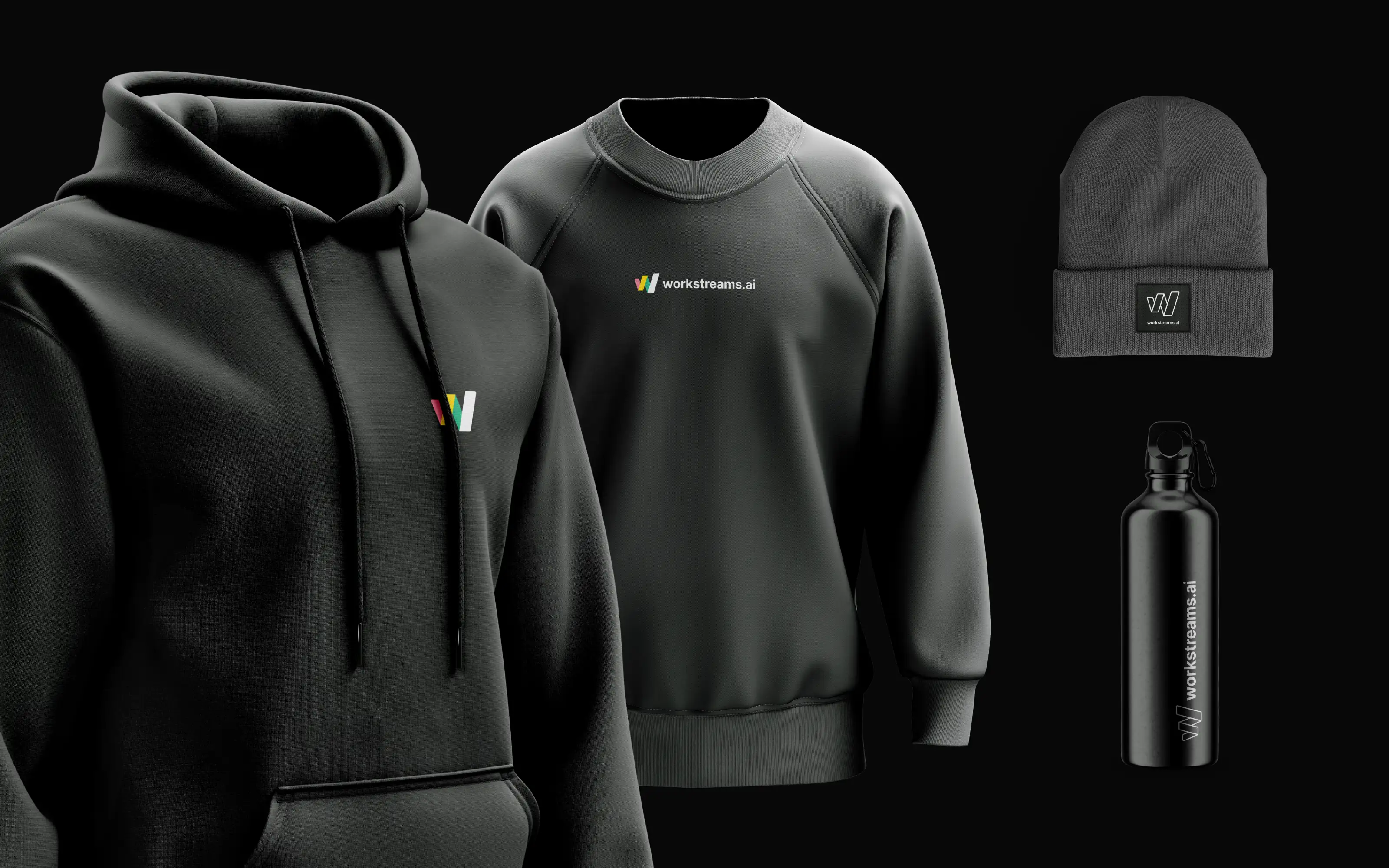
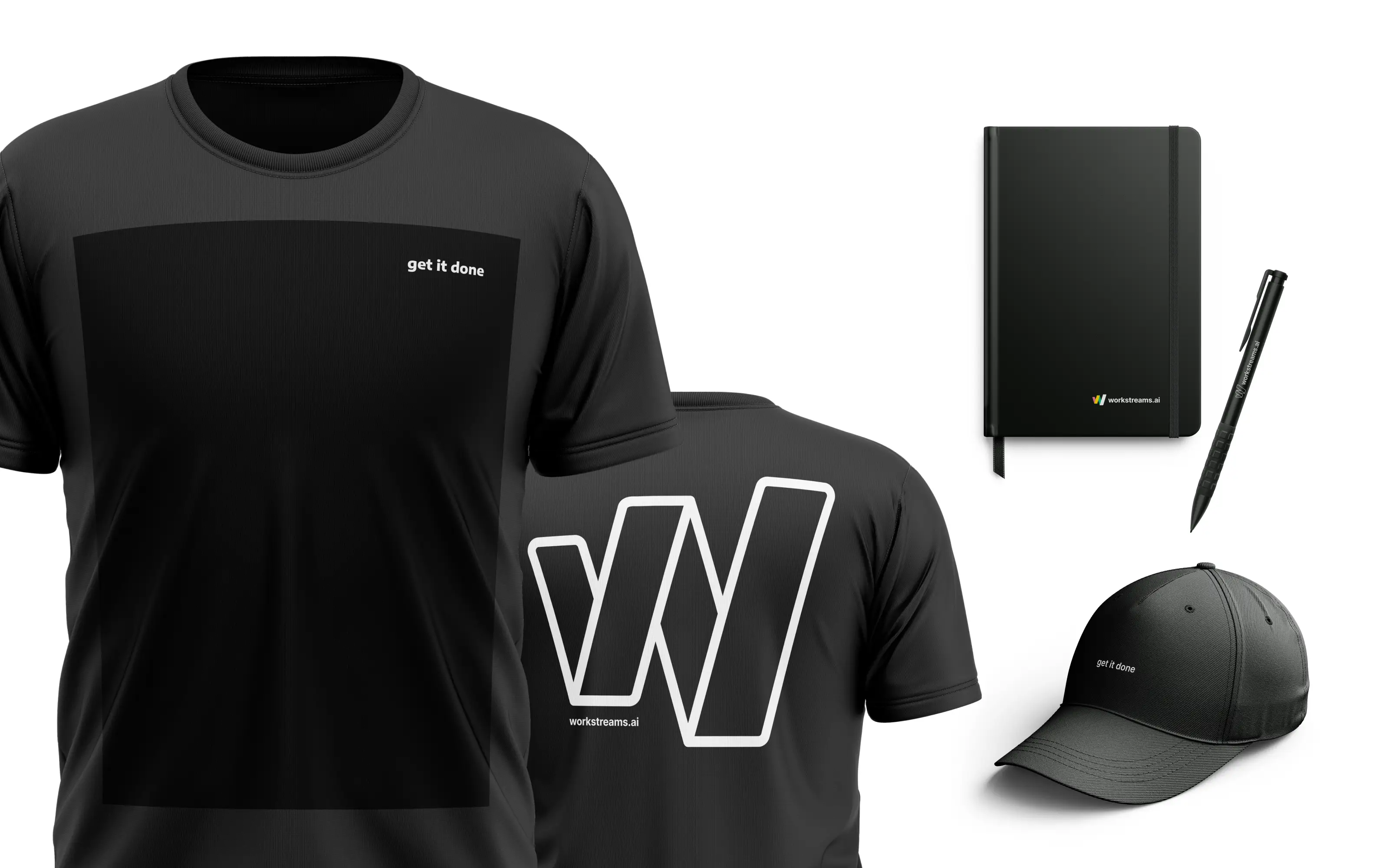
This strategy brought reliability, consistency, and time efficiency to brand asset creation. Social media content, merchandising, the website, and many other elements all benefited from this cohesive approach.
I also worked on workstreams.ai Design System , that led me to many explorations on UX/UI Design.